Blood Orange, 2021
Concept
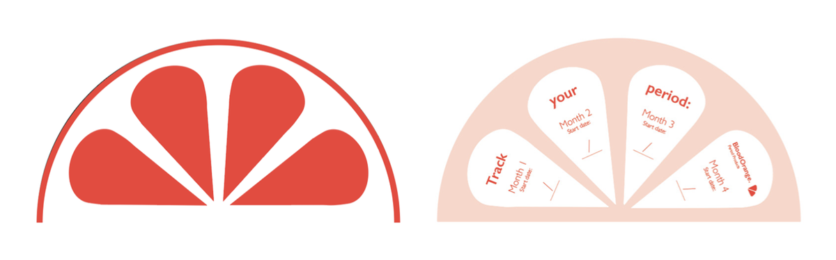
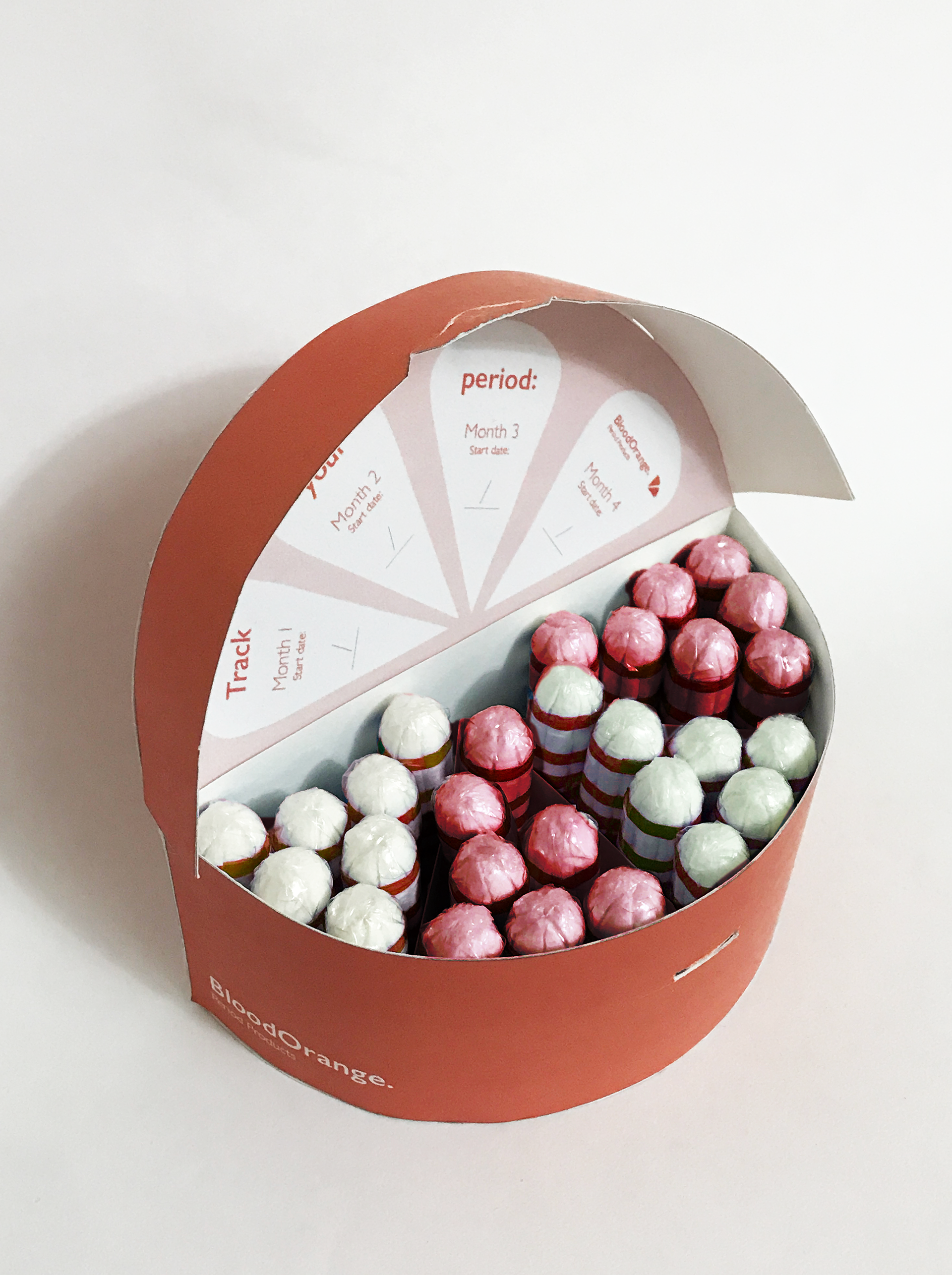
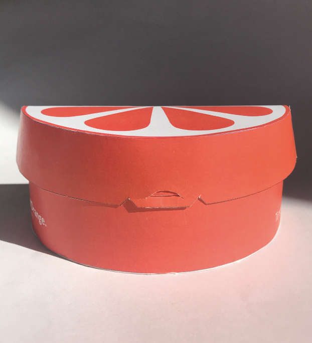
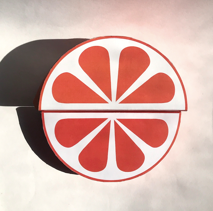
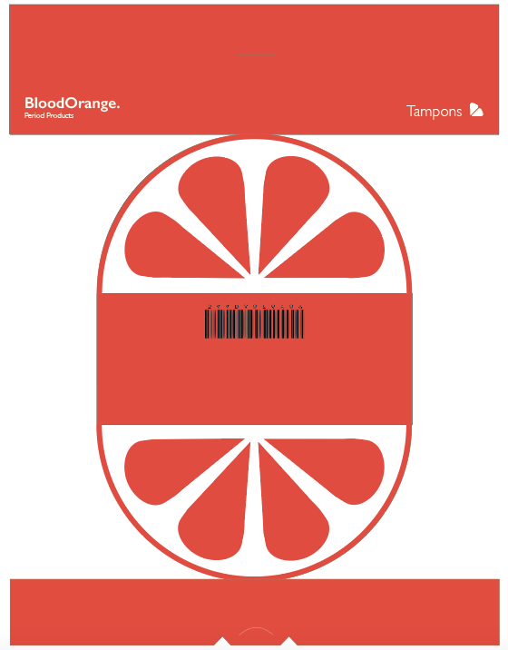
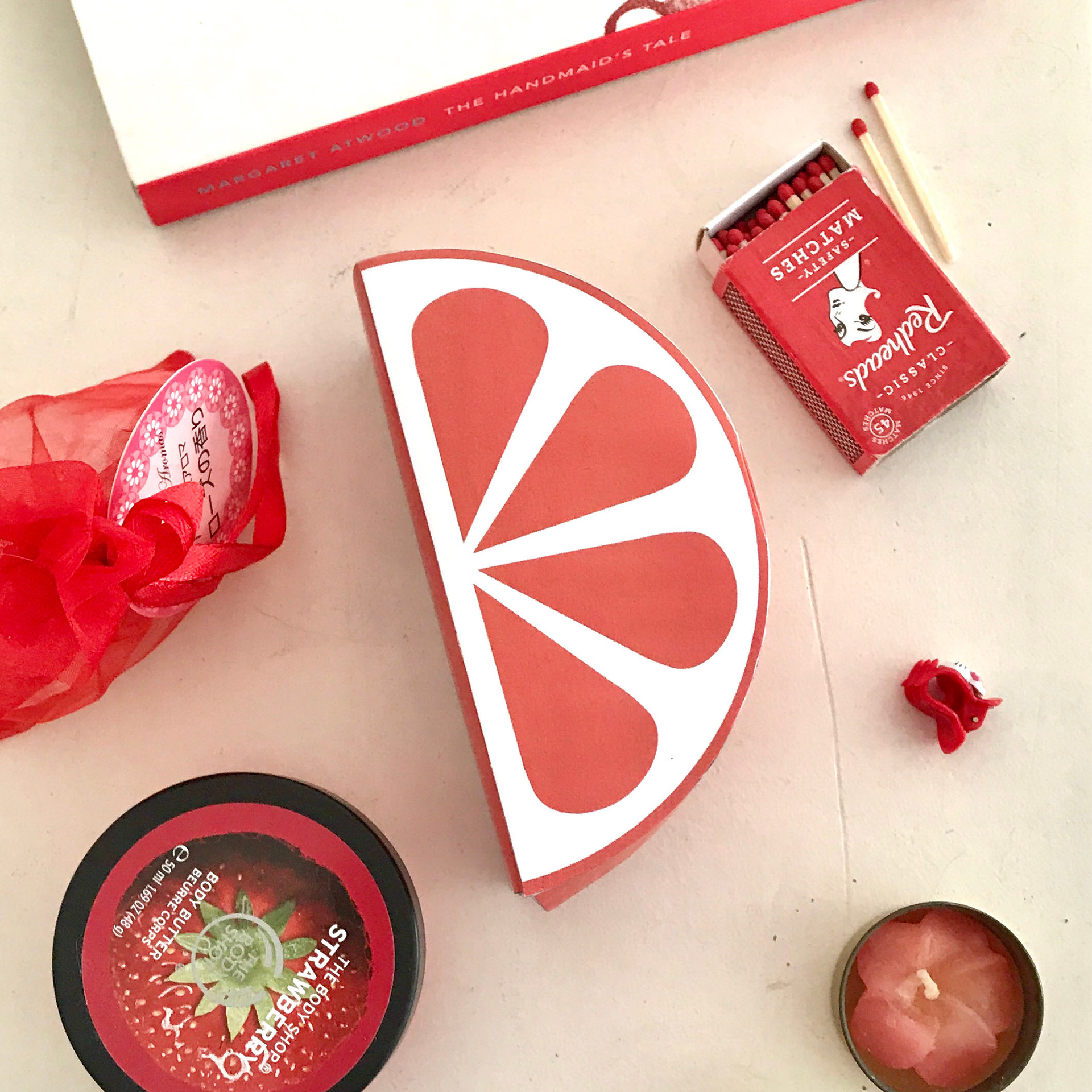
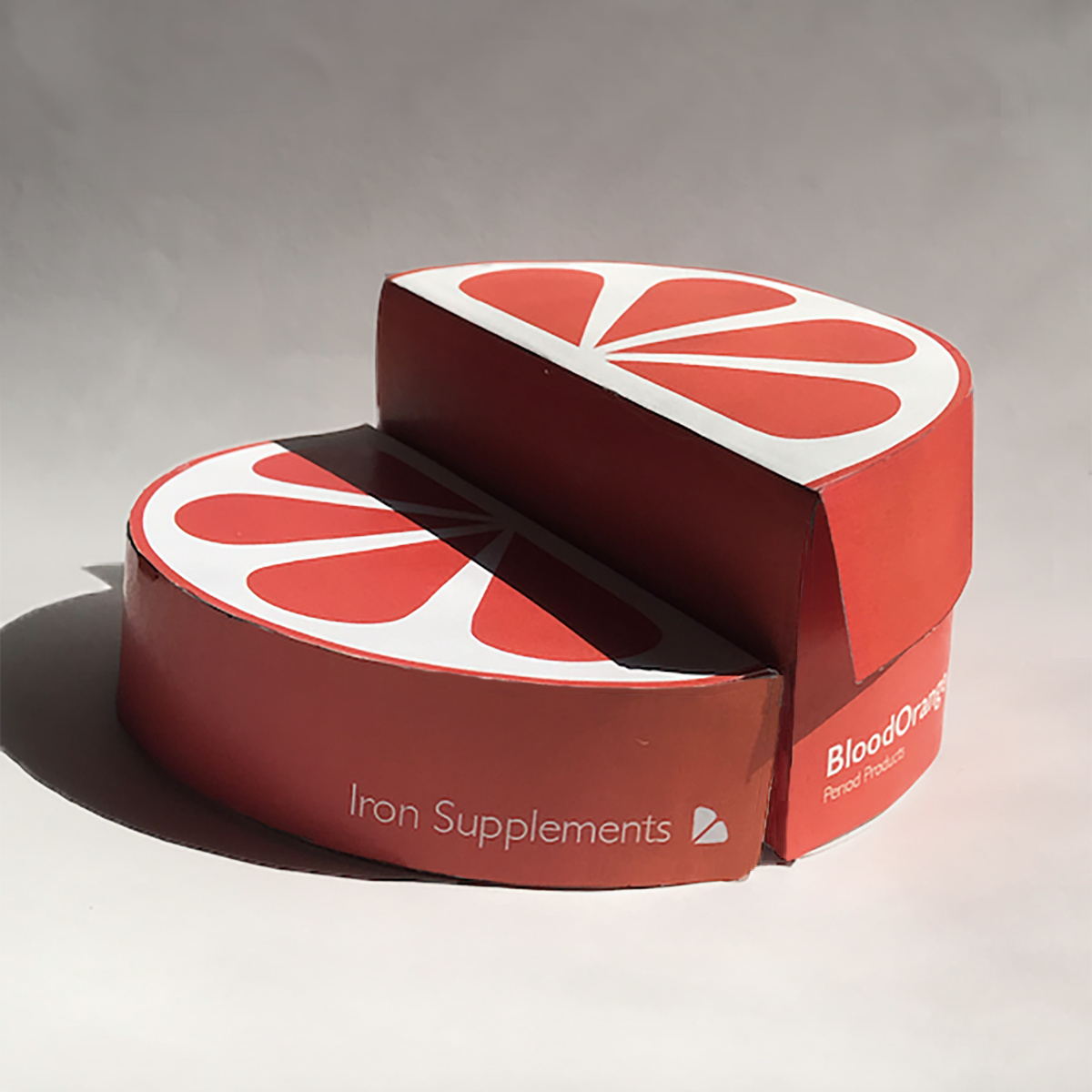
‘Blood Orange’ is a packaging design concept for tampons and iron supplement pills. This project was part of a graphic design university assignment, where I was tasked to design packaging and branding for two items - one of which represented the idea of ‘ritual’, and the other ‘repair’. I chose to create a brand that tied the two items together, packaging tampons and iron supplement pills as products that are connected conceptually by the experience of menstruation, as many people who menstruate suffer from iron deficiency. The tampons embody the monthly ritual of menstruation and the iron supplement pills signify repair of the body.
I loved that I was able to explore a fun concept with this project, using the metaphor of the ‘Blood Orange’ and incorporating it into the visuals. My goal with ‘Blood Orange’ was to create a playful yet bold design that refuses to give in to the taboo around menstruation by shying away from the blood centred reality of the experience. ‘Blood Orange’ allows people who menstruate feel proud of purchasing period products and challenges the stigmatisation of period blood.
Skills Developed
Brand identity design
Packaging design
Prototyping
User consideration